-
Working in partnership with BiggerHalf’s - Ali Stewart, I explored, refined and developed a more robust visual language that was to be rolled out across their external and internal communications.
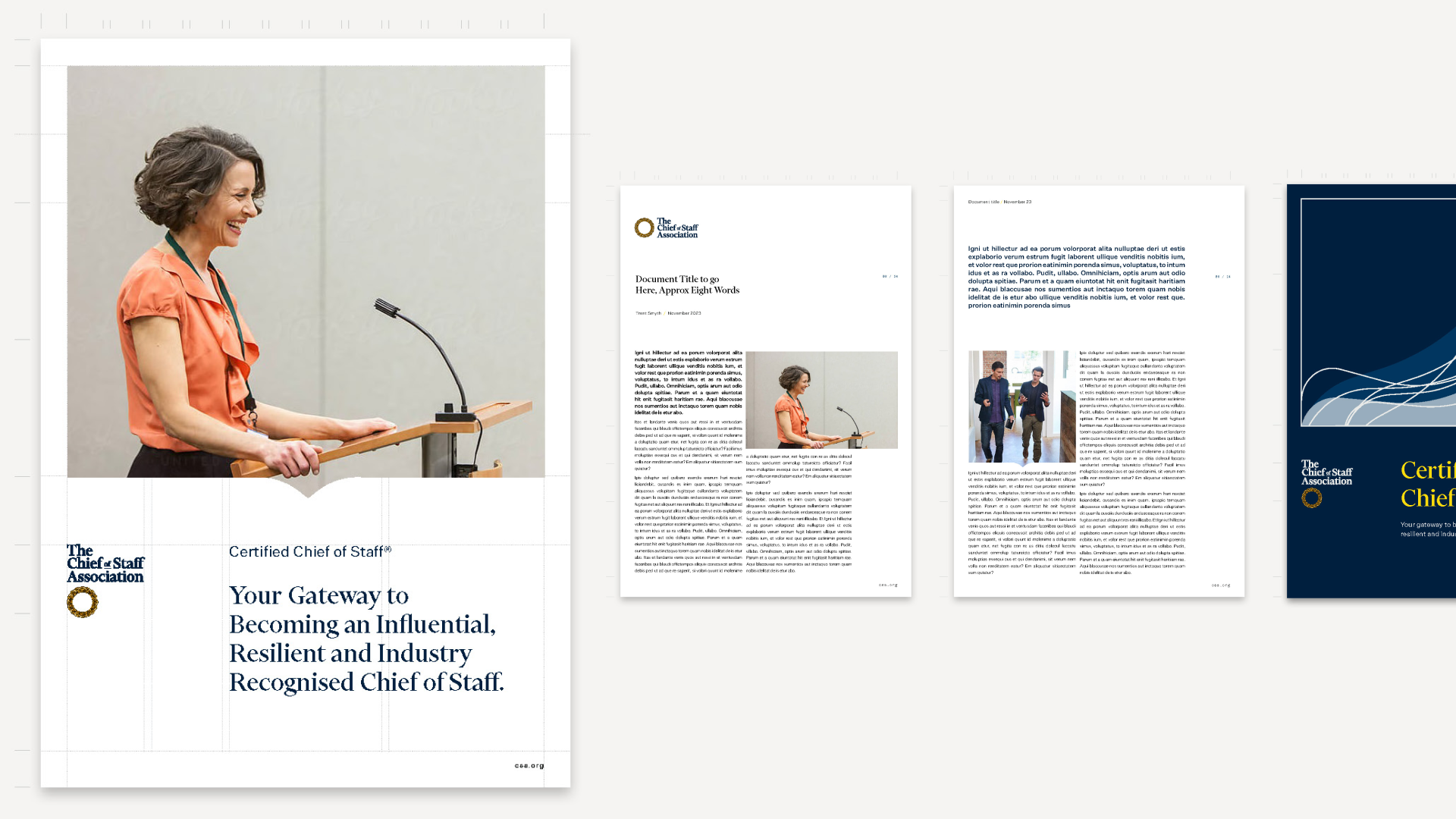
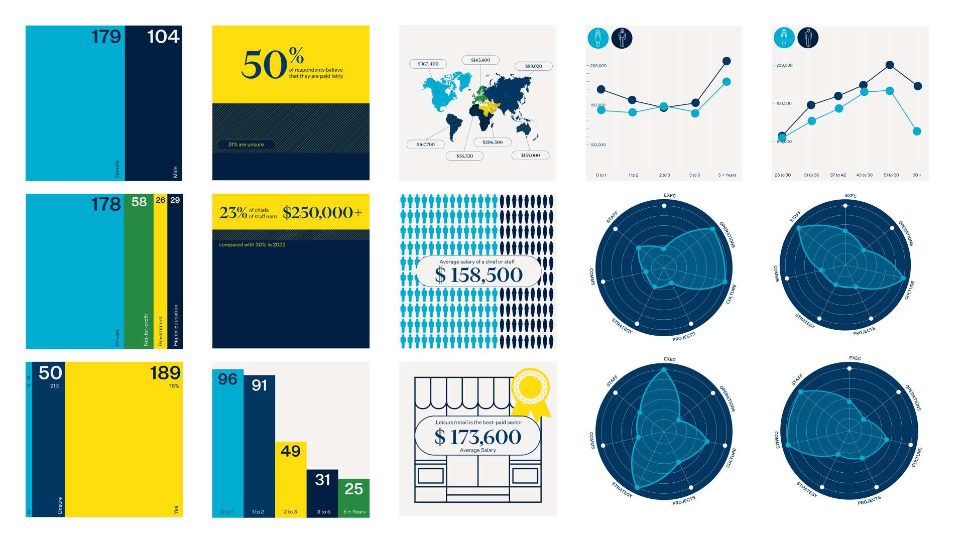
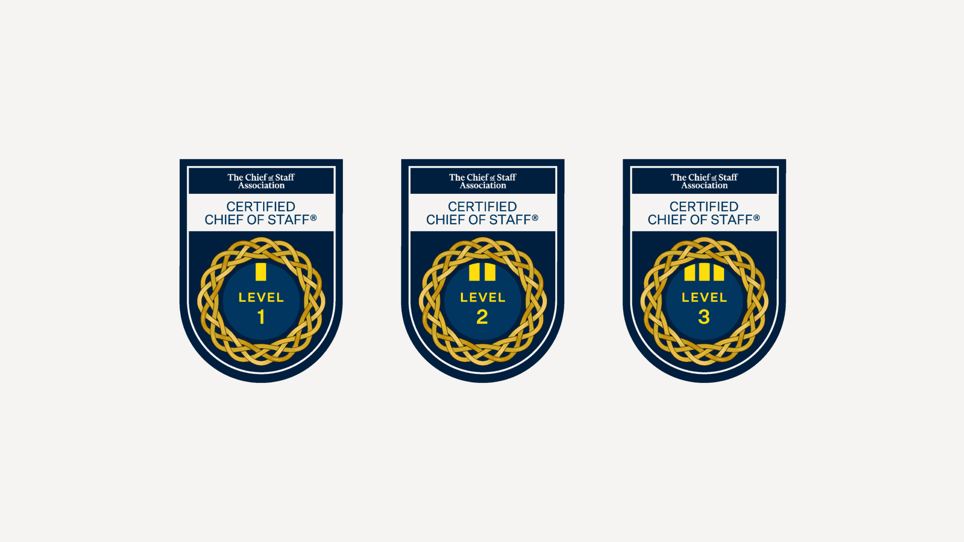
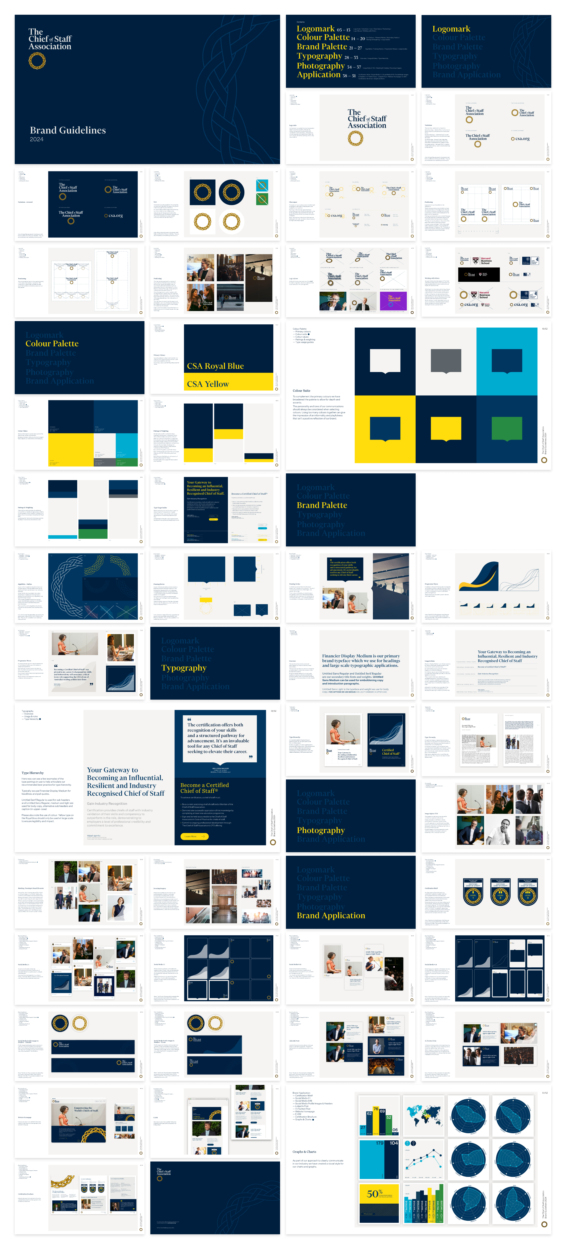
Their brand already had a well recognised and respected aesthetic that carried huge value, so my role was to clarify and solidify the palette, considering the ownership and scalability of the brand. The output of this project was a thorough set of brand guidelines, social templates and infographics, giving them a visual toolkit they could run with.





-
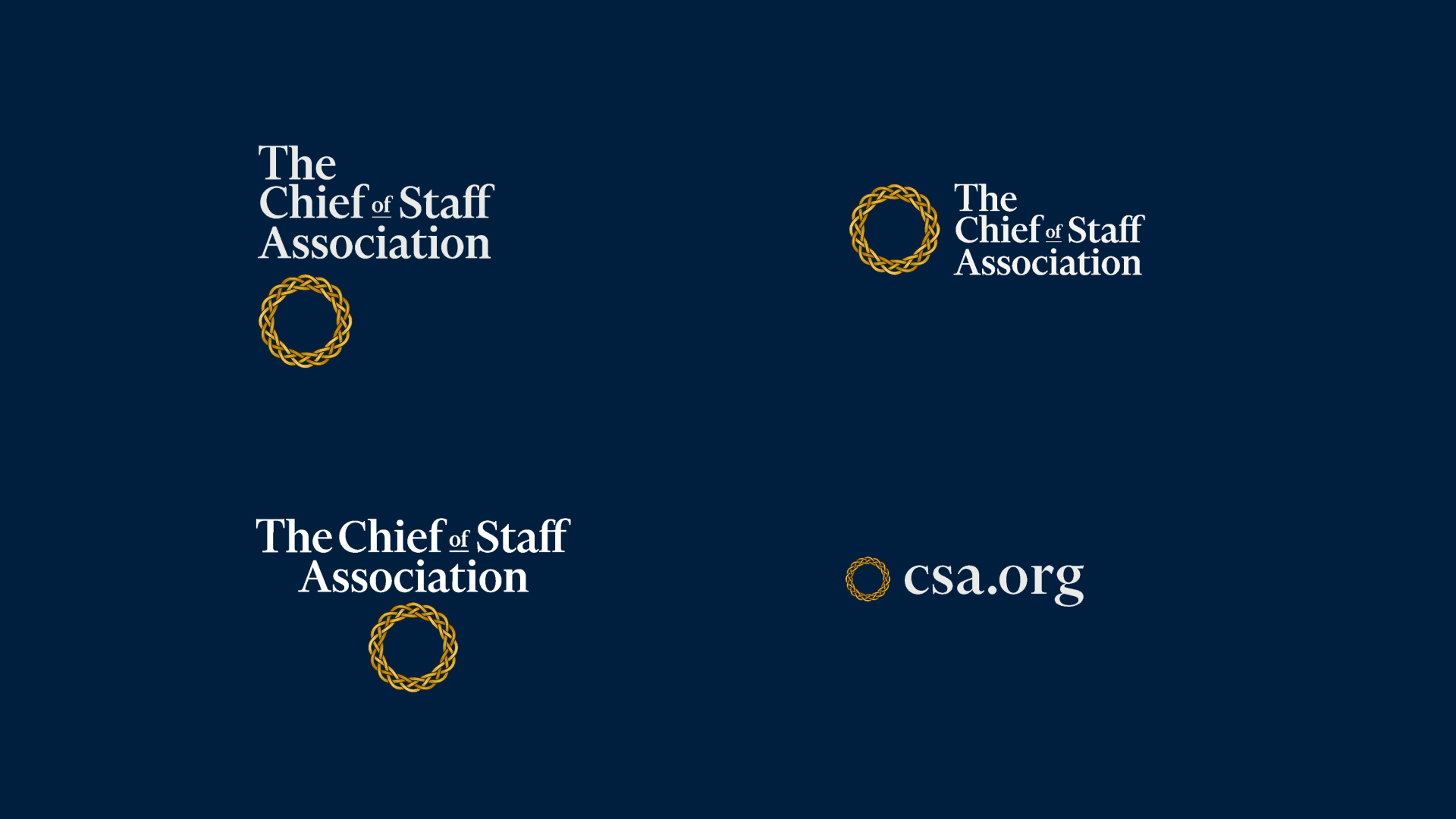
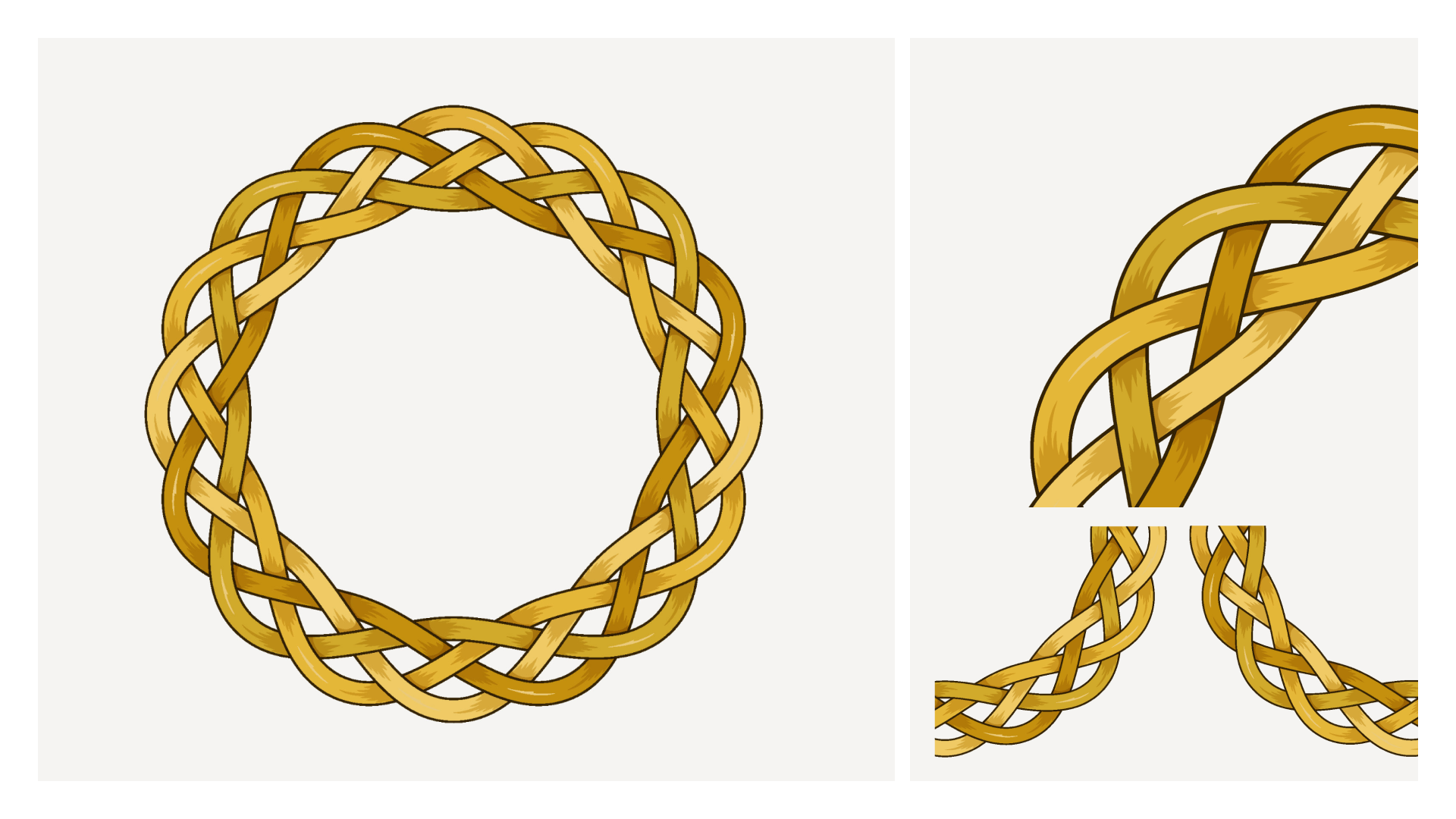
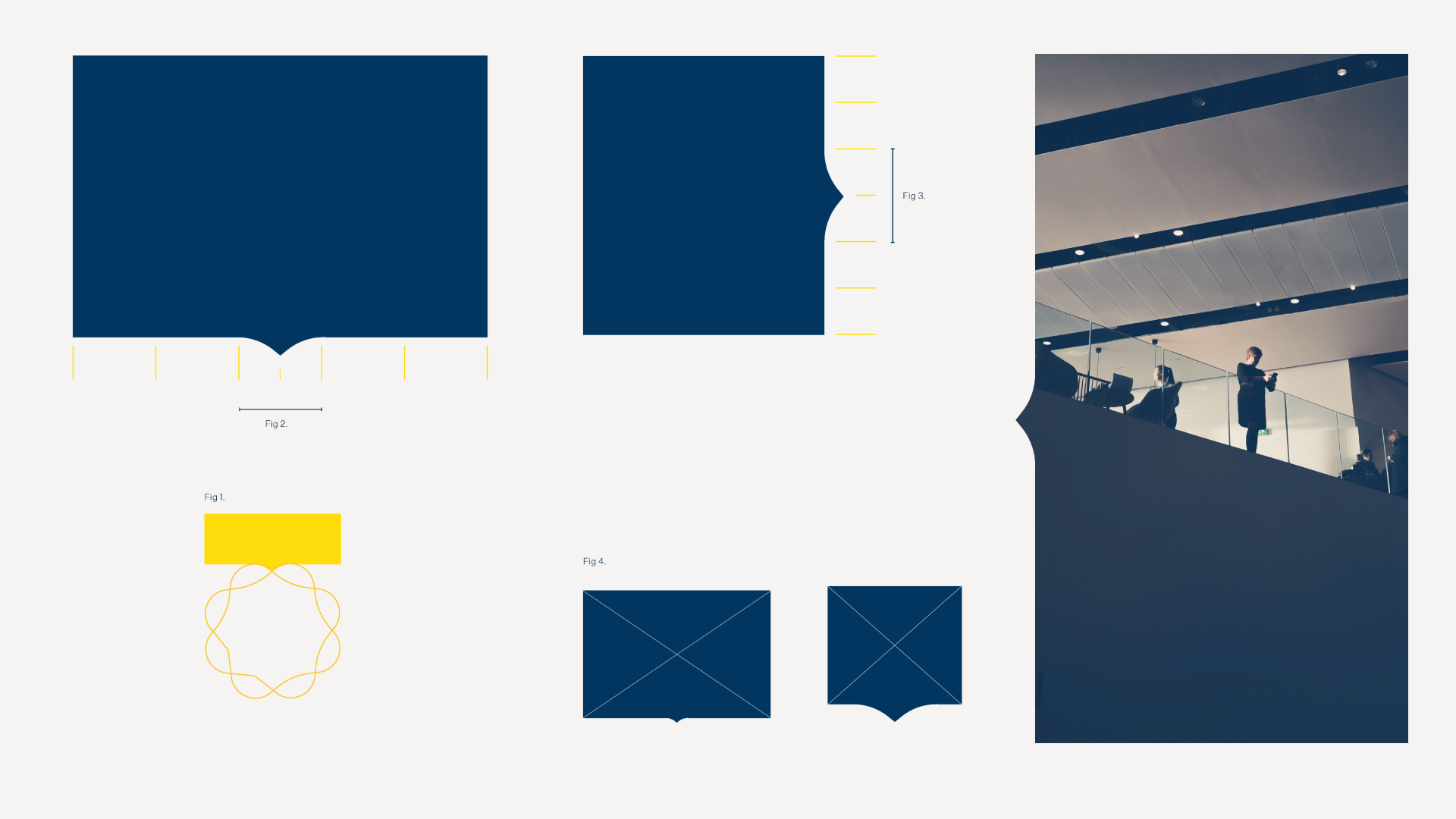
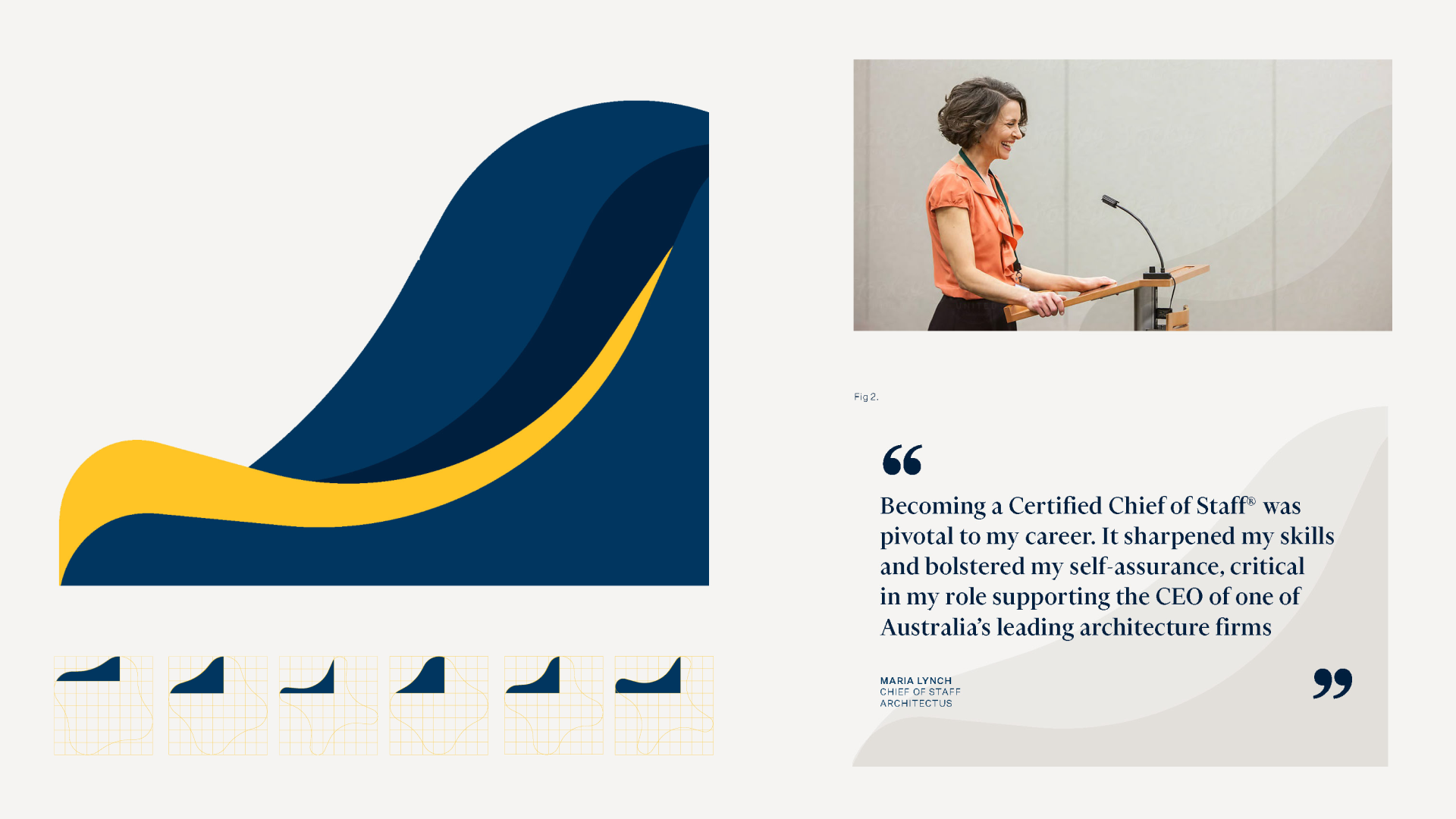
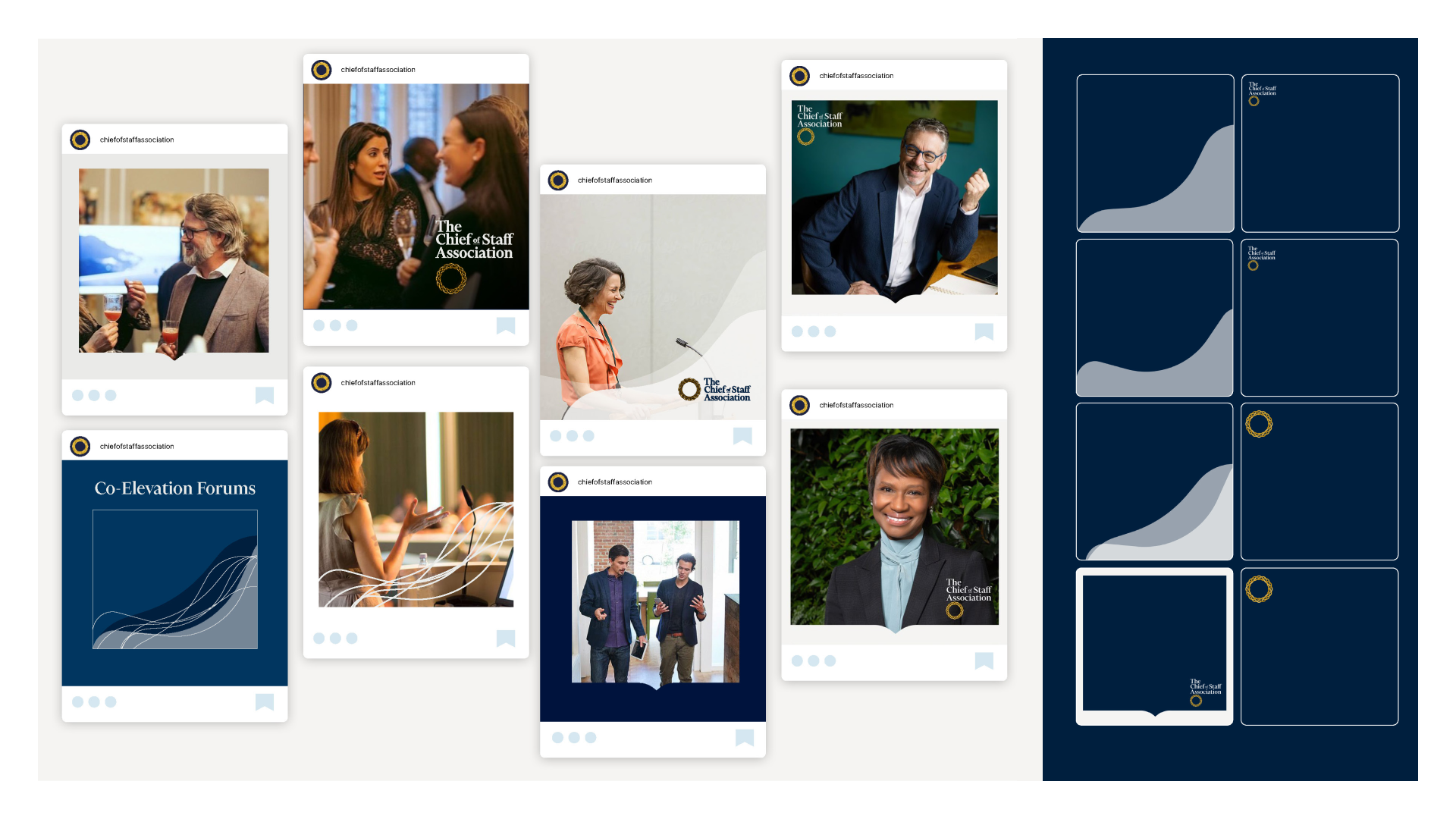
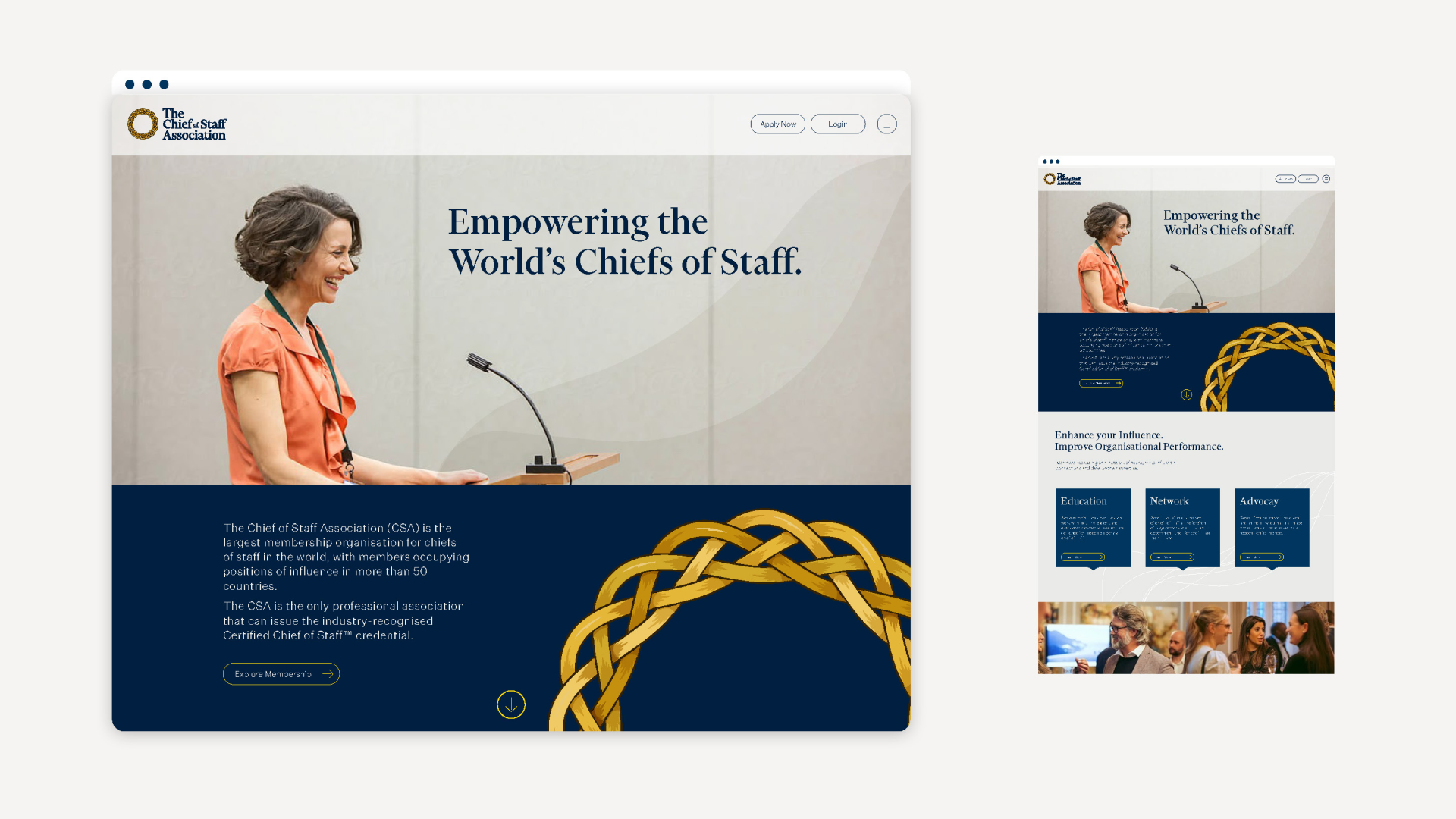
The visual language was built around their most recognisable element, the Aguillette. It was redrawn to scale better, the colours where simplified and brightened. I then deconstructed it which allowed me to create a palette of unique assets, from the pinch framing device, to the progression wave image treatment.
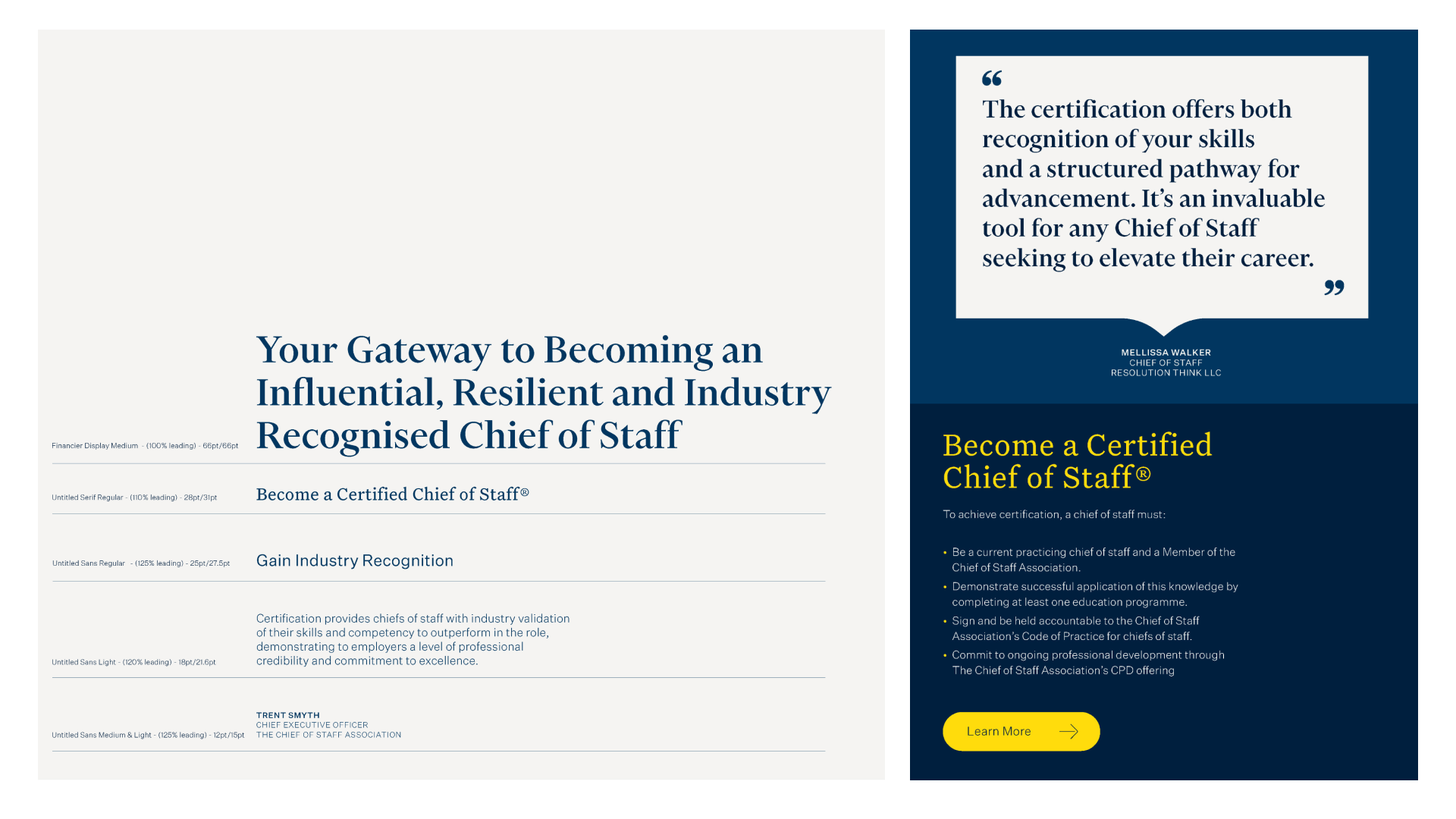
Accompanied by a clear set of instructions around type hierarchy and a clearer design system meant that the brand guidelines and toolkit allows the CSA team to communicate confidently and consistently internally and externally.
The brand refinement was part of a larger strategic piece, lead by Alastair which included creating a new marketing strategy, updating the visual identity and rolling these strategic and visual updates out across all collateral. The process was a collaborative one between myself and Alastair, and our client Jeremy and Trent.
In partnership with BiggerHalf - Ali Stewart
